说明:在介绍Widget的出后可能会涉及到一些属性,例如 Color, EdgeInsets等等。我会在其中穿插的说明,以后遇到这样的问题就不会再次说明。
Container
Container:一个拥有绘制,定位,调整大小的widget。
Container在使用的时候一般不会直接使用其作为容器组件,通常需要有一个父控件。例如:Center, Padding, Colunm, Row, Scaffold等等。
下面是Dart中Container的属性参数1
2
3
4
5
6
7
8
9
10
11
12
13
14Container({
Key key,
this.alignment,
this.padding,
Color color,
Decoration decoration,
this.foregroundDecoration,
double width,
double height,
BoxConstraints constraints,
this.margin,
this.transform,
this.child,
})
继承关系
Object -> Diagnosticable -> DiagnosticableTree -> Widget -> StatelessWidget Container
属性
color
color这个属性在大多数的Widget中都是可以设置的,表示的就是颜色的意思,无论是组件的背景色还是文字的颜色,都是需要用到color属性。但是这里如果要和color属性设置值的话,不会像在前端中一样设置字符串(例如red)或者16进制(例如#FFF)又或者是rgba这样的形式,需要转变一下思维。在Flutter中,这些常用颜色值以及用一个对象保存下来了,那就是Colors。所以我穿插的来讲讲Colors这个对象,看看他的用法。如果foregroundDecoration设置的话,可能会遮盖color效果。
Colors
第一种使用方法就是直接调用Colors这个对象,我们可以看到会有提示,提示我们有哪些值
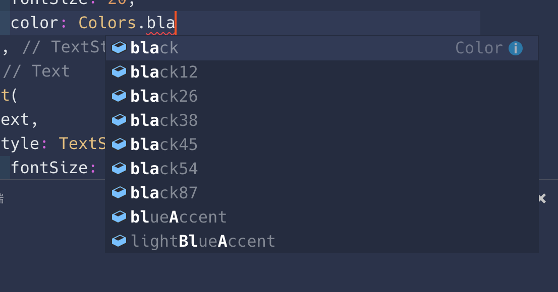
例如上图中的black的值就有好几种。但是我们并不能确定其中的12,26,38这些是什么。其实这些是颜色的透明度(Alpha Or Opacity)
第二种就是使用Color属性自己构建颜色,这里有三种表示方式。下面我们使用这三种方式来表示一个完全不透明的白色
8位16进制表示:
0xFFFFFFFF。或许你没有接触过这种表示方式,更多的是使用#FFF或者#FFFFFF的形式表示。这种事ARGB的颜色表示形式,前面的A表示的就是透明度(Alpha Or Opacity),后面的就不用多说了。那前面的A是使用的FF,那是怎么算的哪?简单说明一下。透明度分为256阶(0-255),计算机上面使用16进制表示为( 00 -ff )。透明就是0阶,完全不透明就是255阶。加入透明度是50%,那就是256阶的一半。256 / 2 = 128,所以,你以为就是128了么,错了,因为256阶是从0开始的而不是从1开始的,所以还需要减一,就是128 - 1 = 127阶。那127在用16进制表示就是7F。关于10进制与16进制的转行可以前往在线进制转换。Colors中提供的颜色值就是这种方式写的。.formARGB() : 第二个方法就是使用
Color.formARGB(),接收四个参数,A,R,G,B,都是int整型的数字。取值范围都是[0, 255]。第一个A就是上面说到的透明度。.formRGBO() : 与第二个方法的区别就是透明度放在了最后一个参数,而且值是
double类型的。取值范围是[0.0, 1.0]。
这就是Flutter中颜色的集中设置方法。
Child
顾名思义,就是设置他的子元素,可以设置也可以不设置,如果不设置,前面也已经说了结果了。
Alignment
这个属性是可以设置子元素在Container容器中的对齐方式,值包含以下几种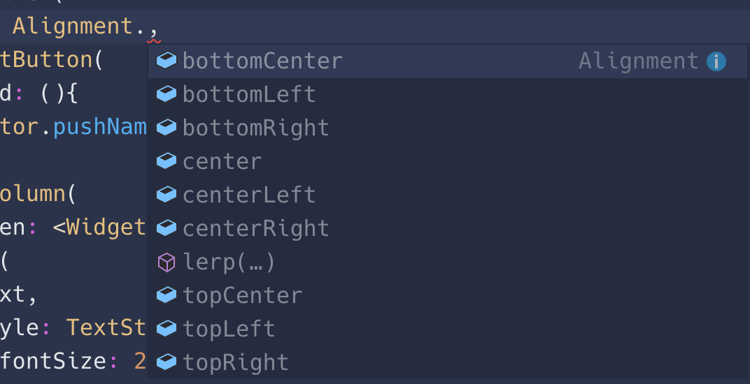
上面的固定值不做过多说明,来谈谈lerp这个方法。Alignment.lerp(a, b, c)。这个方法相当于是区间取值,方法接收三个参数,前两个就是Alignment的固定的取值,比如说Alignment.center,第三个是一个double类型的数值,取值范围是[0.0, 1.0]。如果值是0.0,那么取a值,如果是1.0,那么取b值。
上面说到了lerp方法,不是那几个固定的值那么她是怎么取值的呢?其实就是取坐标中的点。附上一个图,在举个例子你就明白了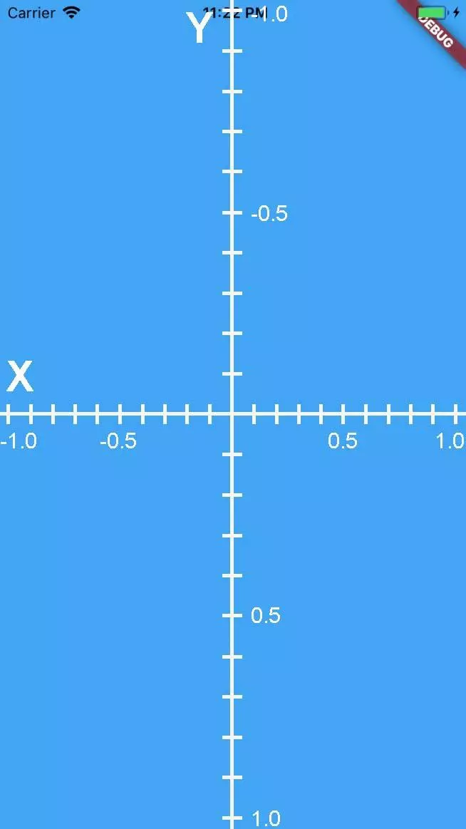
Alignment.topLeft 等价于 Alignment(-1.0, -1.0)。
需要注意的是Alignment直接使用的话,两个参数的取值范围是[-1.0, 1.0]。
下面是App中的源码1
2
3
4
5
6
7
8
9
10
11
12
13
14
15
16
17
18
19
20
21
22
23
24
25
26
27
28
29
30
31
32
33
34
35
36
37
38
39
40
41
42
43
44
45
46
47
48
49
50
51
52
53
54
55
56
57
58
59
60
61
62
63
64
65
66
67
68
69
70
71
72
73
74
75
76
77
78
79
80
81
82
83
84
85
86
87
88
89
90
91
92
93
94
95
96
97
98
99
100
101
102
103
104
105
106
107
108
109
110
111
112
113
114
115
116
117
118
119
120
121
122
123
124
125
126
127
128
129
130
131
132
133
134
135
136
137
138
139
140
141
142
143
144
145
146
147
148
149
150
151
152
153
154
155
156import 'package:flutter/material.dart';
void main() => runApp(AlignmentInfo());
class AlignmentInfo extends StatefulWidget {
State<StatefulWidget> createState() {
return _AlignmentInfo();
}
}
class _AlignmentInfo extends State<AlignmentInfo> {
Object position = Alignment.center;
double _X = 0.0;
double _Y = 0.0;
Widget build(BuildContext context) {
return Center(
child: Column(
children: <Widget>[
Container(
width: 100,
height: 100,
alignment: position,
margin: EdgeInsets.all(10),
color: Colors.blue,
child: Text('踏浪', style: TextStyle(
color: Colors.white,
fontSize: 20
)),
),
Row(
mainAxisAlignment: MainAxisAlignment.spaceAround,
children: <Widget>[
RaisedButton(
child: Text('topLeft'),
onPressed: () => setState(() {
this.position = Alignment.topLeft;
this._X = -1.0;
this._Y = -1.0;
}),
),
RaisedButton(
child: Text('topCenter'),
onPressed: () => setState(() {
this.position = Alignment.topCenter;
this._X = 0.0;
this._Y = -1.0;
}),
),
RaisedButton(
child: Text('topRight'),
onPressed: () => setState(() {
this.position = Alignment.topRight;
this._X = 1.0;
this._Y = -1.0;
}),
)
]
),
Row(
mainAxisAlignment: MainAxisAlignment.spaceAround,
children: <Widget>[
RaisedButton(
child: Text('centerLeft'),
onPressed: () => setState(() {
this.position = Alignment.centerLeft;
this._X = -1.0;
this._Y = 0.0;
}),
),
RaisedButton(
child: Text('center'),
onPressed: () => setState(() {
this.position = Alignment.center;
this._X = 0.0;
this._Y = 0.0;
}),
),
RaisedButton(
child: Text('centerRight'),
onPressed: () => setState(() {
this.position = Alignment.centerRight;
this._X = 1.0;
this._Y = 0.0;
}),
)
]
),
Row(
mainAxisAlignment: MainAxisAlignment.spaceAround,
children: <Widget>[
RaisedButton(
child: Text('bottomLeft'),
onPressed: () => setState(() {
this.position = Alignment.bottomLeft;
this._X = -1.0;
this._Y = 1.0;
}),
),
RaisedButton(
child: Text('bottomCenter'),
onPressed: () => setState(() {
this.position = Alignment.bottomCenter;
this._X = 0.0;
this._Y = 1.0;
}),
),
RaisedButton(
child: Text('bottomRight'),
onPressed: () => setState(() {
this.position = Alignment.bottomRight;
this._X = 1.0;
this._Y = 1.0;
}),
)
]
),
Container(margin: EdgeInsets.all(10)),
Text('Alignment X 的坐标'),
Container(
margin: EdgeInsets.all(10),
child: Slider(
value: _X,
min: -1.0,
max: 1.0,
onChanged: (double value) {
this.setState(() {
this._X = value;
this.position = Alignment(value, _Y);
});
},
),
),
Text('Alignment Y 的坐标'),
Container(
margin: EdgeInsets.all(10),
child: Slider(
value: _Y,
min: -1.0,
max: 1.0,
onChanged: (double value) {
this.setState(() {
this._Y = value;
this.position = Alignment(_X, value);
});
},
),
)
],
),
);
}
}
constraints
constraints可以对Container元素设置最大最小宽高,使用的是BoxConstraint这个对象
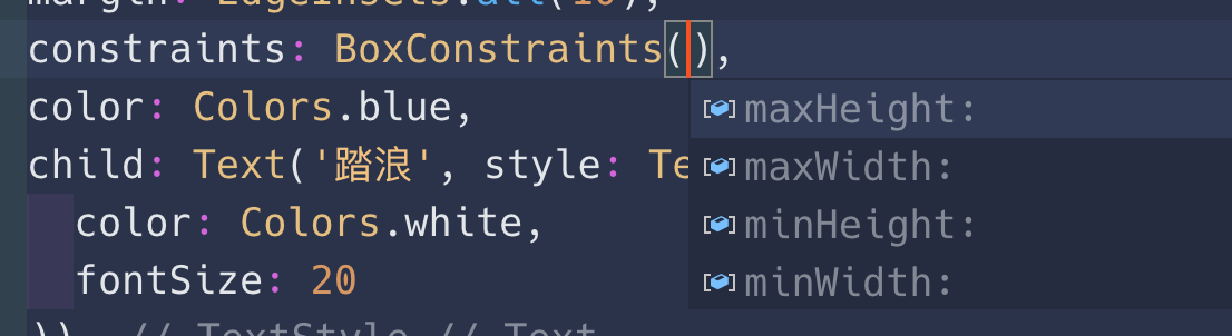
上图中的四个属性就是分别设置最大最小宽高,看属性名字就可以知道,不多说
padding 与 margin
在前端中这两个属性可是用的最多的两个属性了。padding是设置元素的内边距,margin是设置元素的外边距。以一个矩形盒子为例,四条边框为边界,边框以外的是外边距,边框以内的是内边距。
不同于前端的是,Flutter中添加边距需要使用到EdgeInsets对象。他有如下几个使用方法
- EdgeInsets.all()
- EdgeInsets.symmetric()
- EdgeInsets.fromLTRB()
- EdgeInsets.only()
EdgeInsets.all()
参数接收一个number类型的值,设置为四周。比如margin: EdgeInsets.all(10.0)就是给元素设置一个10.0的外间距。
EdgeInsets.symmetric()
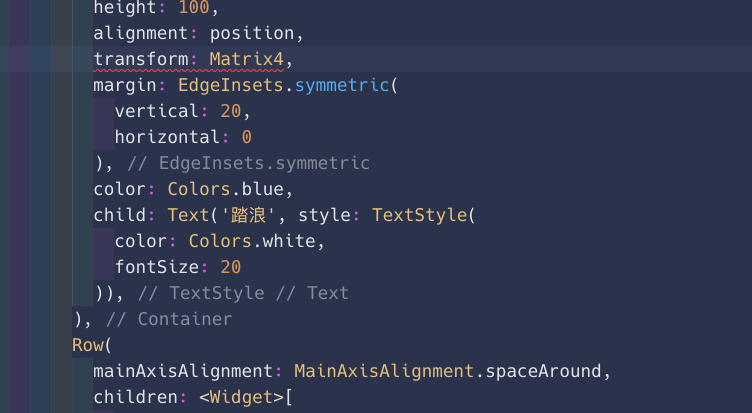
这个可以分别设置水平方向与垂直方向上面的间距1
2
3
4margin: EdgeInsets.symmetric(
vertical: 20,
horizontal: 0
)
上面的代码中就是设置垂直方向上下间距是20,水平方向上面是0
EdgeInsets.fromLTRB()
接收四个参数,分别设置L(left), T(top), R(right), B(bottom)的间距
EdgeInsets.only()
设置四个方向上面哪一个不是0,换句话说,没有设置的就是01
2
3
4
5
6
7
8
9
10
11
12
13
14
15
16
17
18
19
20
21
22
23
24
25
26
27
28
29
30
31
32
33
34
35
36
37
38
39
40
41
42
43
44
45
46margin: EdgeInsets.only(
left: 10,
top: 20
)
```
上面的代码中,就是设置元素左,上的间距是10,20,而没有设置的右,下的间距都是0
**padding与margin的用法是一样的**
## width 与 height
这两个属性就不多说了,设置宽高的两个属性,值是`number`
## transform
`transform`在CSS3中使用的也是非常多的,也包含位移,旋转,缩放等功能。但是使用方法也是和CSS3中略有不同。CSS3中不仅支持关键词还支持`Matrix`矩阵,而Flutter中一般就使用`Matrix4`。
属性太多,就不一个一个介绍了,不过大部分的值的参数都是`number`类型的值。
更多的属性以及关于矩阵的介绍可以查看[https://juejin.im/post/5be2fd9e6fb9a04a0e2cace0](https://juejin.im/post/5be2fd9e6fb9a04a0e2cace0)。在这里感谢掘金大佬提供的线索。
## decoration
`decoration`是修饰,装饰的意思,所以,这个属性也是对容器的一个修饰装饰的属性。比如背景图,边框等等这些就是修饰。
`decoration`可以使用以下几种,分别介绍一下一下几种修饰的使用方法
- BoxDecoration
- FlutterLogoDecoration
- ShapeDecoration
- UnderlineTabIndicator
### BoxDecoration
BoxDecoration 可以设置一下几种属性
```dart
const BoxDecoration({
this.color, // 设置元素背景色
this.image, // 设置元素背景图
this.border,
this.borderRadius,
this.boxShadow,
this.gradient,
this.backgroundBlendMode,
this.shape = BoxShape.rectangle,
})
color
设置背景颜色
有一点需要注意的地方,那就是如果你给元素设置了修饰属性,那么你就不能给元素设置color属性了,因为decoration属性中也是可以设置背景颜色的。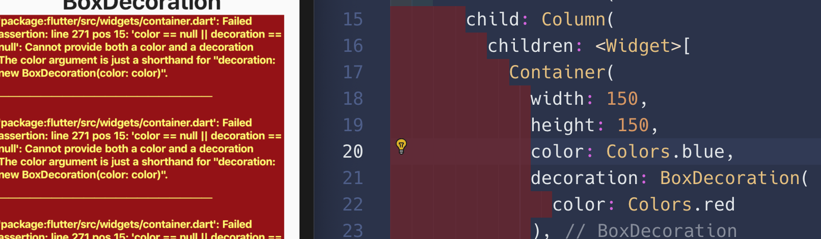
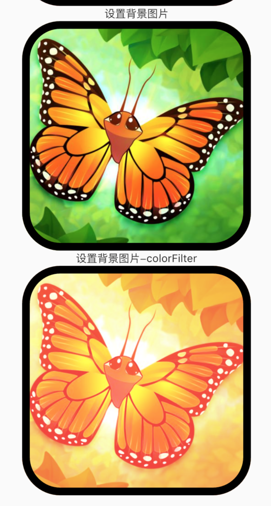
image
设置背景图片,使用的类是DecorationImage。这个图片会出现在背景色和渐变上层。通常使用NetworkImage(网络图片)和AssetImage(本地图片)。
1 | image: DecorationImage( |
再来看看DecorationImage可以设置的属性1
2
3
4
5
6
7
8
9const DecorationImage({
this.image,
this.colorFilter,
this.fit,
this.alignment = Alignment.center,
this.centerSlice,
this.repeat = ImageRepeat.noRepeat,
this.matchTextDirection = false,
})
唯一要求的就是image这个属性,而image属性如何设置值上面已经提到了。那下面几个属性呢?colorFilter这个属性主要是对图片做处理,比如高亮,改变饱和度等等,这个属性用的不多。使用的话就是ColorFilter这个对象,有很多个值,有兴趣的可以自己试一试。
1 | image: DecorationImage( |
还可能用到的属性就是fit属性。这个有点像CSS3中的background-size属性,可以设置BoxFit.cover,用到的类就是BoxFit。其他的属性就不多说,基本使用默认的值就可以。
border
border设置边框,用到的就是Border这个类1
2
3
4border: Border.all(
color: Colors.black,
width: 10
)
你可以使用Flutter给我们封装好的方法比如Border.all,也可以使用Border设置每一个边1
2
3
4
5
6
7
8border: Border(
left: BorderSide(
color: Colors.red,
width: 1,
style: BorderStyle.solid
),
// other side
),
上面的BorderSide,BorderStyle都是Border中的分类。
borderRadius
设置容器的圆角1
borderRadius: BorderRadius.all(Radius.circular(50))
你还可以使用BorderRadius.horizontal,BorderRadius.vertical,BorderRadius.only来设置那个角是圆角。
这里关于BoxDecoration的见到介绍就到这里对了,如果你想了解gradient以及更多的其他属性,可以查看简书Flutter之BoxDecoration用法详解,感谢huoshe2019提供的优质文章。
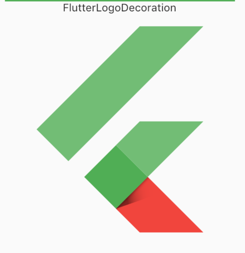
FlutterLogoDecoration
FlutterLogoDecoration在盒子修饰中用的不多,更多的是用在Logo的修饰中。而且,如果你一使用这个属性,那么就会出来一个Flutter的图标。1
2
3
4
5
6
7
8
9Container(
width: 300,
height: 300,
decoration: FlutterLogoDecoration(
darkColor: Colors.red,
lightColor: Colors.green,
textColor: Colors.green
),
)
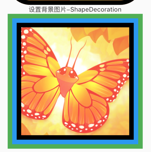
ShapeDecoration
ShapeDecoration的大部分用法和BoxDecoration一直,需要注意的是他没有了设置圆角的功能,但是,border可是设置多个。每一个Border之间用 + 号链接。
1 | decoration: ShapeDecoration( |
UnderlineTabIndicator
这个属性也是基本上是不会使用的,只是给盒子添加一个下边框线1
2
3
4
5
6
7
8
9
10
11Text('UnderlineTabIndicator'),
Container(
width: 300,
height: 300,
decoration: UnderlineTabIndicator(
borderSide: BorderSide(
width: 10,
color: Colors.red
)
),
)
所以,关于decoration这个属性,需要掌握的更多的还是BoxDecoration这个类,功能比较多,但是常用的属性上面已经介绍到了,如果要想了解更多关于渐变以及图片滤镜方面的知识,可以查看Flutter之BoxDecoration用法详解。
foregroundDecoration
foregroundDecoration的使用与decoration的使用时一样的,这里就不做过多的解释。
Container的绘制流程
上面了解了Container的一些常用的属性,当时有的可能我们还处于一脸懵逼的状态,比如上面有了decoration,为什么还有使用方法一模一样的foregroundDecoration呢?其实这就和Container的绘制流程有关系。
Container的回执流程如下:
- 首先会绘制transform效果;
- 接着绘制decoration;
- 然后绘制child;
- 最后绘制foregroundDecoration。
记住这个流程,然后再记住后面的回执的样式会覆盖前面绘制的样式。
关于Container的介绍接到这里,Container是Flutter中非常重要的一个Widget,一定要掌握。
关于同步代码可以查看https://github.com/tal007/FlutterApp。
获取更多关于Flutter的知识点,点击踏浪博客查看。