上一篇介绍了Container
这一篇我们来看看别的Widget。
Row
Row这个Widget其实就是一个布局组件,类似于前端中flex-direction: row;。作用就是可以使Row中的子元素在水平方向上面排列,可以用来做走马灯轮播等效果。
Row可以设置一下几种属性1
2
3
4
5
6
7
8
9
10Row({
Key key,
MainAxisAlignment mainAxisAlignment = MainAxisAlignment.start,
MainAxisSize mainAxisSize = MainAxisSize.max,
CrossAxisAlignment crossAxisAlignment = CrossAxisAlignment.center,
TextDirection textDirection,
VerticalDirection verticalDirection = VerticalDirection.down,
TextBaseline textBaseline,
List<Widget> children = const <Widget>[],
})
mainAxisAlignment
这个属性在上一节介绍Container的时候已经涉及到了,他就是设置子元素在主轴方向上面的对其方式的。取值的话也是前端中对其方式的几种取值
- start
- end
- center
- spaceBetween
- spaceAround
- spaceEvenly
唯一不同的是,在Flutter中新增加了一个spaceEvenly属性,即均匀的分配空间
crossAxisAlignment
同mainAxisAlignment,不同的是他设置的是从轴方向。取值也有一点不同
- start
- end
- center
- stretch : 垂直方向上面拉伸了
- baseline
补充:上面说到了主轴从轴,那究竟是什么方向呢?以
Row为例,这是一个水平方向上排列的Widget,那么他的主轴就是 horizontal(水平) ,从轴就是 vertical(垂直)。
mainAxisSize
这个设置的是主轴的区间大小,值包含min和max两个。
textDirection
顾名思义,这个属性设置的是文字的方向,值包含
- ltr : 从左往右排列
- rtl : 从右往左排列
两个。或许有的朋友觉得没有,那是因为你还没有涉及到从右往左的一个排列的方式。当你遇到阿拉伯语,希伯来语等语言的时候,那这个属性就是一个神器了。关于左右布局的方案可以查看我之前写的关于网站左右布局适配。
verticalDirection
这个也是设置文字的方向,不过我觉得这个属性可能用的更少了,值包含
- up : 从上往下排列
- down : 从下往上排列
textBaseline
设置文字的基线。这里的值没有前端中多。仅仅只有两个
- alphabetic : 用于对齐字母字符底部的水平线。
- ideographic : 用于对齐表意字符的水平线。
这个属性一般不会用到的,但是,如果你要设置 crossAxisAlignment 属性,那么可能需要设置 textBaseline 属性
children
这个属性需要牢记,这个是设置Row子元素的属性,值是一个List集合(即数组),每一项都是一个Widget。
1 | child: Column( |
Column
如果你掌握了Row,那么Column对你来说就是易如反掌。Row是水平方向上面排列的,而Column则是垂直方向上面排列的。这是他们之前唯一的区别,他们的属性一模一样。这里就不在做过多说明。
Image
图片Widget。
1 | const Image({ |
Image
必须有一个image参数,设置图片,可以是网络图片可以是本地图片。
- Image.asset:用来加载本地资源图片,等同于
new AssetImage - Image.file:用来加载本地(File文件)图片,等同于
new FileImage - Image.network:用来加载网络图片,等同于
new NetworkImage - Image.memory:用来加载Uint8List资源(byte数组)图片,等同于
new MemoryImage
Image.asset(or AssetImage)
加载一个本地的资源图片。这里的本地的图片资源指的是什么呢?即你项目中用到的图片,比如logo。注意和接下来讲到的 Image.file 区分。
如果我们需要使用asset类的东西,需要在pubspec.yaml文件中进行配置。如果我们没有修改过初始化后的pubspec.yaml,你会在注释中看到这样的一段注释1
2
3
4# To add assets to your application, add an assets section, like this:
# assets:
# - images/a_dot_burr.jpeg
# - images/a_dot_ham.jpeg
So。如果我们要使用图片,我们需要两个步骤:
- 在根目录下面新建
images文件夹用来存放图片,也可以是其他地方,但是更推荐在根目录中 - 配置
pubspec.yaml
为了更好的适配图片,还是建议使用多套图片,比如images/2.0x和images/3.0x两种类型的图片
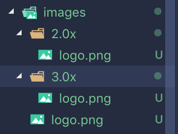
pubspec.yaml中配置如下1
2
3
4assets:
- images/logo.png
- images/2.0x/logo.png
- images/3.0x/logo.png
具体使用就是AssetImage('images/logo.png)
Image.file
这个也是设置本地图片,不用于上面的asset,这个一般不会是项目中存在的图片。可以使相册中的图片或者是相机拍照的图片。
还有,你可能需要image_picker这个插件来完成图片的选择以及拍照。这个插件IOS需要配置一下,安卓不用。
注意:在Info.plist中设置权限的时候需要使用英文1
2
3
4
5
6<key>NSPhotoLibraryUsageDescription</key>
<string>Use the gallery to select phonts</string>
<key>NSCameraUsageDescription</key>
<string>Use the camare to take phonts</string>
<key>NSMicrophoneUsageDescription</key>
<string>Use the Microphone to get voice</string>
Image.network
设置网络图片,使用就是直接传入一个网络图片的地址即可1
new Image.network('/img/favicon-32x32.png')
使用网络图的时候因为是请求的网络上面的资源,有的时候可能会出现请求失败或者是请求错误的情况,这个时候我们需要使用一个占位图或者说是加载出错显示的图片,那么需要使用到FadeInImage
占位图
1 | FadeInImage.assetNetwork( |
上面代码中的placeholder属性就是站位属性,站位的图片是一个静态资源图片,你还可以设置透明的占位图。
但是我们无法设置网络图片加载出错显示的图片,这里可是使用第三方的工具cached_network_image1
2
3
4
5
6
7new CachedNetworkImage(
width: 120,
fit: BoxFit.fitWidth,
placeholder: new CircularProgressIndicator(),
imageUrl: imageUrl,
errorWidget: new Icon(Icons.error),
)
Image.memory
加载 Uint8List 图片。用来将一个 byte 数组加载成图片,用法如下:1
new Image.memory(bytes)
width<Double> and height<Double>
这里的 width 和 height 并不是设置图片的宽高,而是设置这个Image容器的宽高,用来显示图片的宽高。1
2
3
4
5
6
7
8
9Image(
image: AssetImage('images/logo.png'),
width: 100,
height: 100,
alignment: Alignment.center,
repeat: ImageRepeat.repeat,
// fit: BoxFit.cover,
filterQuality: FilterQuality.low,
)
比如App上面的AssetImage案例
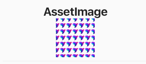
上面设置的图片width和height。但是图片其实是很小的,因为设置了repeat(重复)属性,所以可以看到很多个小图片。如果要设置图片的宽高,可以设置了width和height后在设置fit:BoxFit.cover属性。
semanticLabel<String>
图像的语义描述,用于向Andoid上的TalkBack和iOS上的VoiceOver提供图像描述
talkback是一款由谷歌官方开发的系统软件,它的定位是帮助盲人或者视力有障碍的用户提供语言辅助
Voiceover功能是APPLE公司在2009年4月新推出的一种语音辅助程序
excludeFromSemantics<Bool>
是否启用图像的语义描述。
color<Colors>
颜色。设置图片的颜色,会覆盖图片原有的颜色,像是前端中的字体图标,可以指定颜色。一般会和colorBlendMode配合使用
colorBlendMode<BlendMode>
用于将color与此图像组合。
默认为BlendMode.srcIn。在混合模式方面,color是来源,此图像是目的地。
fit<FixBox>
图片如何在Image控件中显示,有以下几个值可选1
2
3
4
5
6
7
8
9enum BoxFit {
fill, // 填充整个容器,宽高都不超出容器
contain, // 按宽高中最小的那个来放大
cover, // 按宽高中最大的那个来放大
fitWidth, // 按照width放大
fitHeight, // 按照高度方法
none, // 不填充
scaleDown,
}
具体的效果可以查看[]
FlutterApp案例源码
alignment
用来控制图片的对齐方式,这个属性在介绍Container的时候已经介绍过了,如果你忘了,可以回头看看
repeat
设置图片的重复。这个属性就像是CSS中设置背景重复一样
包含以上几种属性,一般很少设置重复属性的。
- noRepeat: 不设置重复。默认值
- repeat: 重复X轴与Y轴
- repeatX: 重复X轴
- repeatY: 重复Y轴
Image其他的几个属性基本上都用不到。可能会用到的就是上面介绍到的,如果你有兴趣,可以自行了解。以上就是关于Image Widget的简单说明。
Text
Text Widget用的是非常多的一个组件,要显示文字就需要用到这个组件。使用也是很简单的。1
2
3
4
5
6
7
8
9
10
11
12
13
14const Text(
this.data, {
Key key,
this.style,
this.strutStyle,
this.textAlign,
this.textDirection,
this.locale,
this.softWrap,
this.overflow,
this.textScaleFactor,
this.maxLines,
this.semanticsLabel,
})
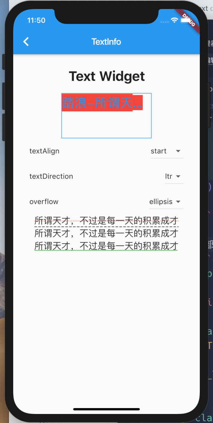
首先需要传一个data,即我们需要显示的文字。接下来就是其中的每一项属性了
textAlign
对其方式
- left 左对齐
- right 右对齐
- center 居中
- justify 两端对齐
- statr 开始对齐,大部分条件下等同于 left
- end 结束对齐,大部分条件下等同于 right
textDirection
文字方向,就两个值 ltr 与 rtl
locale
此属性很少设置,用于选择区域特定字形的语言环境
softWrap
某一行中文本过长,是否需要换行。默认为true,如果为false,则文本中的字形将被定位为好像存在无限的水平空间
overflow
超出文本的显示方式
- TextOverflow.clip 超出部分裁剪
- TextOverflow.ellipsis 超出部分显示省略号,用的更多
- TextOverflow.fade 超出部分显示透明
textScaleFactor<double>
每个逻辑像素的字体像素数。有点像是把文字放大多少倍。
maxLines<int>
显示的文本的行数
semanticsLabel
图像的语义描述,用于向Andoid上的TalkBack和iOS上的VoiceOver提供图像描述
talkback是一款由谷歌官方开发的系统软件,它的定位是帮助盲人或者视力有障碍的用户提供语言辅助
Voiceover功能是APPLE公司在2009年4月新推出的一种语音辅助程序
style
这个属性才是用的更多的一个属性,主要是设置字体的样式,包括但不限于字体,字体大小,颜色,字体类型等。
使用的是TextStyle下面的类1
2
3
4
5
6
7
8
9
10
11
12
13
14
15
16
17
18
19
20
21
22
23
24const TextStyle({
this.inherit = true, // 集成父级样式
this.color, // 设置颜色
this.backgroundColor, // 设置背景颜色
this.fontSize, // 设置字体大小
this.fontWeight, // 设置字体粗细 FontWeight.bold
this.fontStyle, // 设置字体样式 FontStyle.normal FontStyle.italic斜体
this.letterSpacing, // 设置字间距
this.wordSpacing, // 设置词间距
this.textBaseline, // 文本基线
this.height, // 设置行高
this.locale, // 此属性很少设置,用于选择区域特定字形的语言环境
this.foreground, // 文字的前景色
this.background, // 文字的背景色
this.shadows, // 设置字体阴影
this.decoration, // 上划线,下划线以及删除线
this.decorationColor, // 划线的颜色
this.decorationStyle, // 划线的样式 这个style可能控制画实线,虚线,两条线,点, 波浪线等
this.decorationThickness,
this.debugLabel,
String fontFamily, // 字体
List<String> fontFamilyFallback, // 多个字体,是一个数组
String package,
})
文字下划线1
2
3
4
5
6
7
8
9
10
11
12
13
14
15
16
17
18
19
20
21children: <Widget>[
Center(child: CustomTitle(title: "Text Widget")),
TextDemo(),
Center(child: Text(text, style: TextStyle(
decoration: TextDecoration.lineThrough,
decorationColor: Colors.red,
decorationStyle: TextDecorationStyle.dotted,
fontSize: 20,
))),
Center(child: Text(text, style: TextStyle(
decoration: TextDecoration.overline,
decorationStyle: TextDecorationStyle.dashed,
fontSize: 20,
))),
Center(child: Text(text, style: TextStyle(
decoration: TextDecoration.underline,
decorationStyle: TextDecorationStyle.wavy,
fontSize: 20,
decorationColor: Colors.green
))),
]
大部分的文字样式1
2
3
4
5
6
7
8
9
10
11
12
13
14
15
16
17
18
19
20
21
22
23
24
25
26
27
28
29
30
31
32
33
34
35
36
37
38
39
40
41
42
43
44
45
46
47
48
49
50
51
52
53
54
55
56
57
58
59
60
61
62
63
64
65
66
67
68
69
70
71
72
73
74
75
76
77
78
79
80
81
82
83
84
85
86
87
88
89
90
91
92
93
94
95
96
97
98
99
100import 'package:flutter/material.dart';
void main() => runApp(TextDemo());
class TextDemo extends StatefulWidget {
TextDemo({Key key}) : super(key: key);
_TextDemoState createState() => _TextDemoState();
}
class _TextDemoState extends State<TextDemo> {
TextAlign _textAlign = TextAlign.left;
TextDirection _textDirection = TextDirection.ltr;
TextOverflow _textOverflow = TextOverflow.visible;
Widget build(BuildContext context) {
return Container(
margin: EdgeInsets.only(top: 20),
child: Column(
children: <Widget>[
Container(
width: 200,
height: 100,
decoration: BoxDecoration(
border: Border.all(
color: Colors.blue,
width: 1,
style: BorderStyle.solid
)
),
child: Text(
'踏浪-所谓天才,不过是每一天的积累成才',
textAlign: _textAlign,
textDirection: _textDirection,
maxLines: 1,
overflow: _textOverflow,
textScaleFactor: 2,
style: TextStyle(
color: Colors.blue,
backgroundColor: Colors.red
),
),
),
ListTile(
title: Text('textAlign'),
trailing: DropdownButton(
value: _textAlign,
items: TextAlign.values.map((value) => DropdownMenuItem(
child: Text(value.toString().substring('TextAlign.'.length)),
value: value
)).toList(),
onChanged: (newVal){
if( newVal != null ){
setState(() {
_textAlign = newVal;
});
}
},
)
),
ListTile(
title: Text('textDirection'),
trailing: DropdownButton(
value: _textDirection,
items: TextDirection.values.map((value) => DropdownMenuItem(
child: Text(value.toString().substring('TextDirection.'.length)),
value: value
)).toList(),
onChanged: (newVal){
if( newVal != null ){
setState(() {
_textDirection = newVal;
});
}
},
)
),
ListTile(
title: Text('overflow'),
trailing: DropdownButton(
value: _textOverflow,
items: TextOverflow.values.map((value) => DropdownMenuItem(
child: Text(value.toString().substring('TextOverflow.'.length)),
value: value
)).toList(),
onChanged: (newVal){
if( newVal != null ){
setState(() {
_textOverflow = newVal;
});
}
},
)
)
],
),
);
}
}
以上就是关于Text Widget的简单介绍。
这一节就介绍这四种Widget,后续再来介绍其他的Widget。
如果你喜欢文本,请支持一下博主,谢谢。