上一节我们介绍了Row, Column, Image, Text四个基础组件,这一节我们来看看下面几个组件。
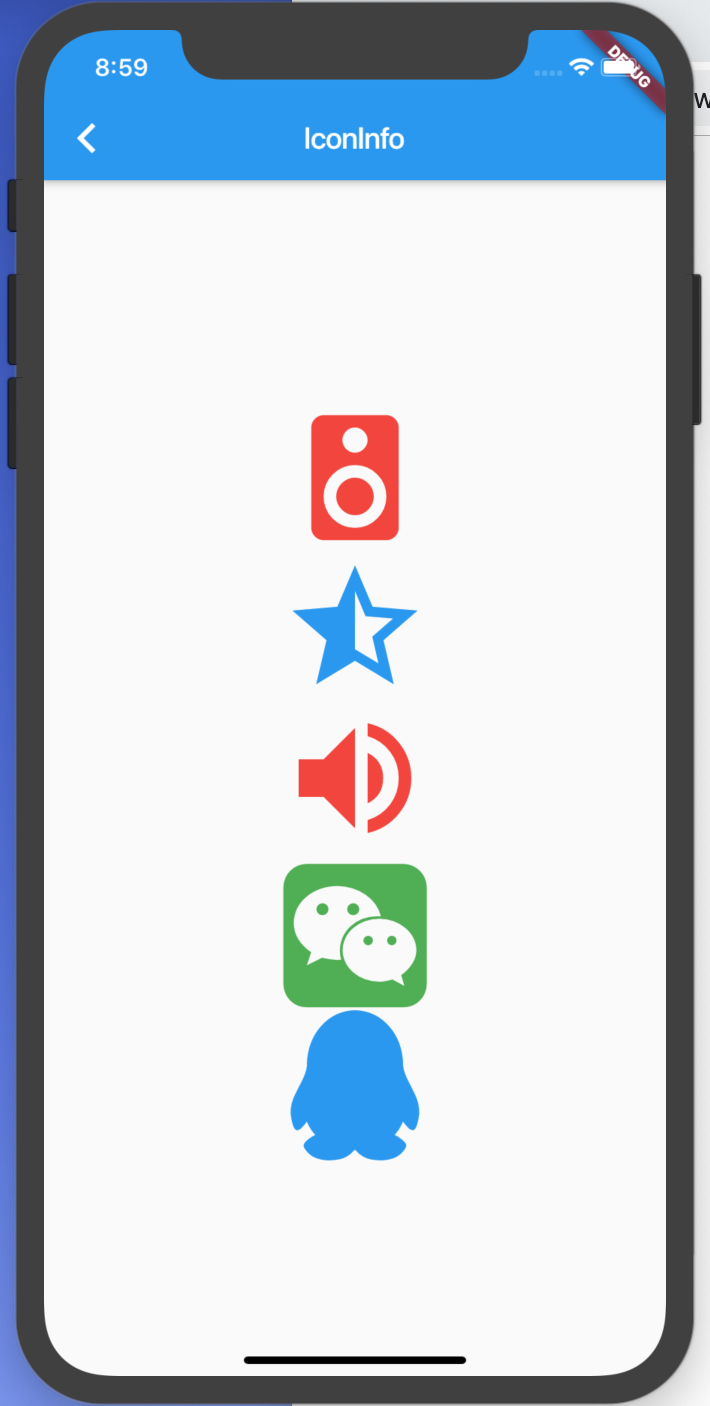
Icon
Icon就是图标,字体图标,矢量图。在web前端中我们使用图标可以自己定义字体与SVG,使用阿里图标上面的图标。在Flutter中,google则为我们集成了一些常用的图标。
看看Icon的属性有哪些1
2
3
4
5
6
7
8const Icon(
this.icon, {
Key key,
this.size,
this.color,
this.semanticLabel,
this.textDirection,
}) : super(key: key);
我们能够用到的就是 size 与 color 两个属性,第一个是字体。使用Icons类。下面有很多图标。
1 | child: Column( |
当然,这些都是 Flutter material 中自带的一些图标,如果我们需要自己定义图标怎么弄呢?这也是可以的,就像我们在web中使用 iconfont 一样。
1 | Icon( |
上面的代码中出现了 MyIcons 这个类。哪里来的呢?其实这个是我们自己创建的类,怎么创建的来看看。
1 | import 'package:flutter/material.dart'; |
MyIcons 是我们自己创建的类,里面定义了两个Icon,一个名字是weChat,另一个是qq。使用的是IconData这个类创建,里面有三个参数。Icon的Unicode编码,这个在阿里图标上表示在这里
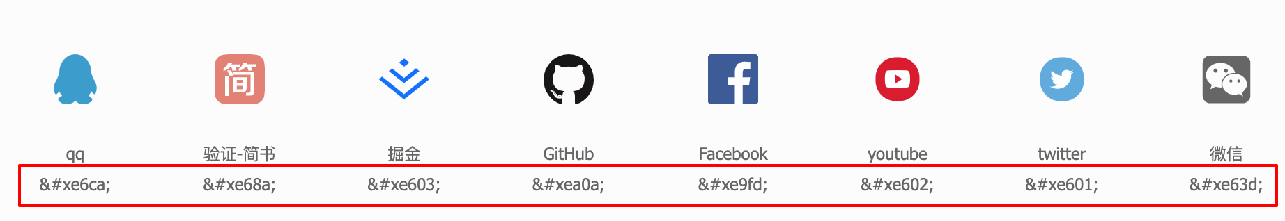
我们把上面的 &# 换成 0 就可以了。
fontFamily呢?是我们自己定义的字体
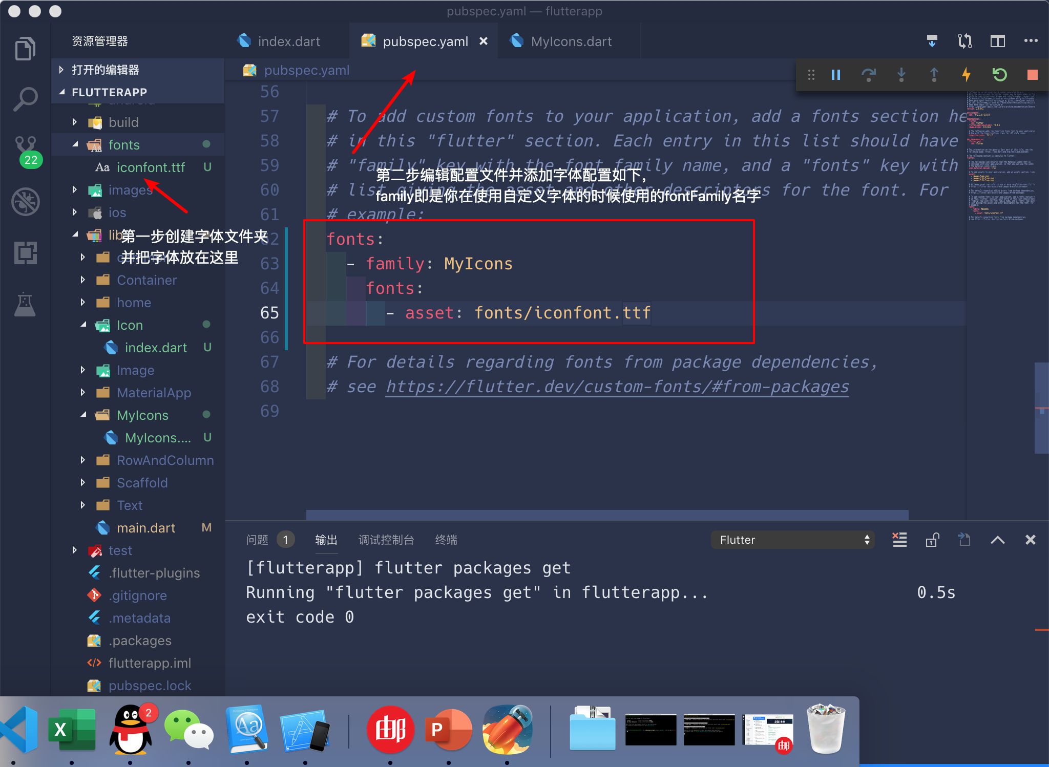
字体呢就是我们在阿里图标上面下载下来的文件。
这些就是关于 Icon 的简单介绍。
RaisedButton
其实这就是一个按钮,一个凸起的材质矩形的按钮。
1 | const RaisedButton({ |
属性有很多,能用到的也就那么几个,大部分都是使用的默认值。
下面是App中的源码1
2
3
4
5
6
7
8
9
10
11
12
13
14
15
16
17
18
19
20
21
22
23
24
25
26
27
28
29
30
31
32
33
34
35
36
37
38
39
40
41
42
43
44
45
46
47
48
49
50
51
52
53
54
55
56
57
58
59
60
61
62
63
64
65
66
67
68
69
70
71
72
73
74
75
76
77child: Column(
children: <Widget>[
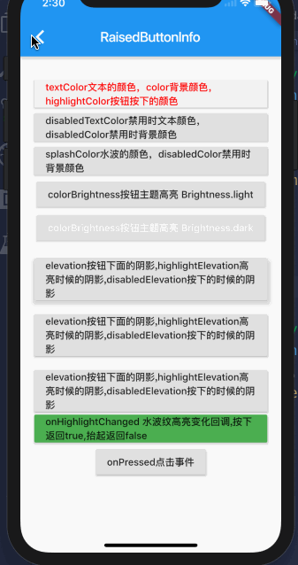
RaisedButton(
onPressed: () {},
child: Text("textColor文本的颜色,color背景颜色,highlightColor按钮按下的颜色"),
textColor: Color(0xffff0000),
color: Color(0xfff1f1f1),
highlightColor: Color(0xff00ff00),
),
RaisedButton(
onPressed: () {},
child: Text("disabledTextColor禁用时文本颜色,disabledColor禁用时背景颜色"),
disabledTextColor: Color(0xff999999),
disabledColor: Color(0xffff0000),
),
RaisedButton(
onPressed: () {},
child: Text("splashColor水波的颜色,disabledColor禁用时背景颜色"),
splashColor: Color(0xffff0000),
),
RaisedButton(
onPressed: () {},
child: Text("colorBrightness按钮主题高亮 Brightness.light"),
colorBrightness: Brightness.light,
),
RaisedButton(
onPressed: () {},
child: Text("colorBrightness按钮主题高亮 Brightness.dark"),
colorBrightness: Brightness.dark,
),
Container(
margin: EdgeInsets.only(top: 20.0),
child: RaisedButton(
onPressed: () {},
child: Text(
"elevation按钮下面的阴影,highlightElevation高亮时候的阴影,disabledElevation按下的时候的阴影"),
elevation: 5.0,
),
),
Container(
margin: EdgeInsets.only(top: 20.0),
child: RaisedButton(
onPressed: () {},
child: Text(
"elevation按钮下面的阴影,highlightElevation高亮时候的阴影,disabledElevation按下的时候的阴影"),
highlightElevation: 5,
),
),
Container(
margin: EdgeInsets.only(top: 20.0),
child: RaisedButton(
onPressed: () {},
child: Text(
"elevation按钮下面的阴影,highlightElevation高亮时候的阴影,disabledElevation按下的时候的阴影"),
disabledElevation: 5.0,
),
),
RaisedButton(
onPressed: () {},
child: Text(
"onHighlightChanged 水波纹高亮变化回调,按下返回true,抬起返回false"),
onHighlightChanged: (bool b) => Fluttertoast.showToast(
msg: '$b',
toastLength: Toast.LENGTH_LONG,
fontSize: 12
),
),
RaisedButton(
onPressed: () => Fluttertoast.showToast(
msg: '你点击了按钮',
toastLength: Toast.LENGTH_LONG,
fontSize: 12
),
child: Text("onPressed点击事件"),
),
],
)v
就像上面的代码中看到的,除了onPressed是必选以外,其余的属性基本上用的不是特别的多,有一些没有涉及到的属性,有兴趣可以自己下来了解。
Scaffold
之前简单提到过Scaffold,因为我们用到这个Widget的时候实在是太多了。
1 | const Scaffold({ |
Scaffold可以说是一个容器,里面可以设置很多地方的Widget,比如AppBar,drawer,bottomNavigationBar等等。下面的每一部分又有自己单独的设置方法。还是来看看怎么使用。
AppBar
1 | AppBar({ |
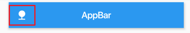
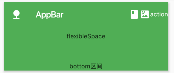
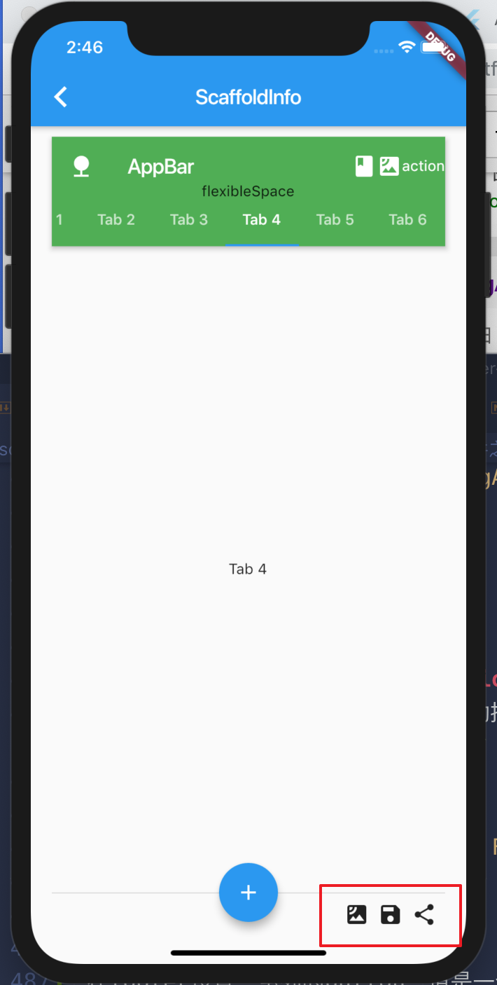
来看看AppBar中每一部分的布局,下面图片来自Flutter官网
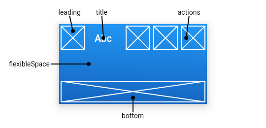
leading
正如上面的图片中看到的,这个属性可以设置AppBar左侧的内容
1 | appBar: AppBar( |
这里设置的是一个 nature 图标,当然,你也可以设置其他的图标,或者是其他的Widget,文字,图片等等。
automaticallyImplyLeading
官方的解释为
Controls whether we should try to imply the leading widget if null
我理解为:如果没有设置leading属性,是否需要将leading默认设置为null。左右可能就是做一个站位。默认是true,使用默认值就行。
title
标题。不用多说。
actions
正如上面的图片中看到的,这个属性可以设置AppBar中右侧的显示。上面图片中显示了三个,说明这是一个Widget List。
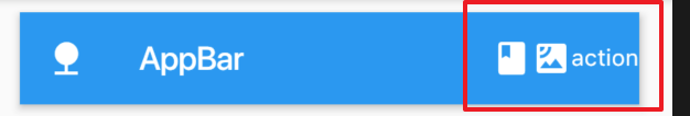
1 | actions: <Widget>[Icon(Icons.book), Icon(Icons.satellite),Center(child: Text('action'))] |
flexibleSapce
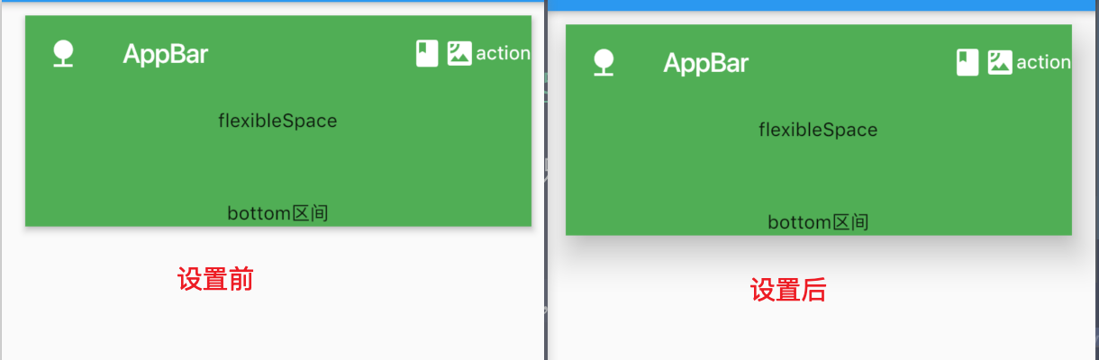
这个最上面的图也有解释。整个AppBar相当于采用flex布局,flexibleSapce空间属于AppBar中除了整个空间。包含了leading,title以及bottom区间。值是一个Widget。
为什么这样说呢?
1 | flexibleSpace: Container( |
上面的代码中我们把alignment属性注释掉了,结果如下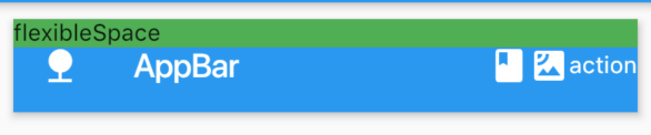
接着我们取消注释
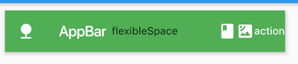
这就是原因。不过这个属性好像不怎么用得着啊。整个AppBar可能用得多的地方就是leading,title和actions了吧。
bottom
一个 AppBarBottomWidget 对象,通常是 TabBar。用来在 Toolbar 标题下面显示一个 Tab 导航栏
1 | bottom: PreferredSize( |
你还可以在bottom中添加TabBar,这样就更加充分利用了bottom这个属性
1 | import 'package:flutter/material.dart'; |
这里收涉及到了TabBar以及TabBarView两个类。这里不多讲,需要注意的是这两个都需要设置一个controller属性,如果不设置,可以使用DefaultTabController创建默认的容器。
elevation
这个属性是设置整个AppBar的阴影的大小,值是一个double。
下面是设置了elevation: 20,的前后对比,还是使用默认的就可以了
backgroundColor
AppBar的背景色。如果flexibleSapce设置了背景色,这个背景色将会被覆盖。
brightness
AppBar的主题,有两个选择,Brightness.dark 或者 Brightness.light。
centerTitle
标题是否居中显示,默认值根据不同的操作系统,显示方式不一样。安卓可能在左侧,IOS则是居中。
body
主题内容区域,这个区域就不介绍了,body可以设置各种Widget。
floatingActionButton
这是一个浮动按钮,注意参数就是一个child(一般是一个Icon),其次就是 onPressed 点击事件。其余的可以使用默认属性,或者你修改一下背景色等等。
1 | const FloatingActionButton({ |
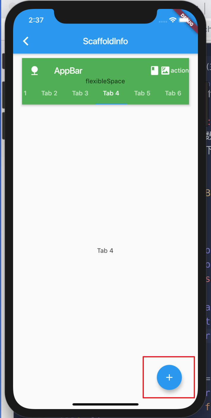
在右下角增加一个浮动按钮1
2
3
4floatingActionButton: FloatingActionButton(
child: Icon(Icons.add),
onPressed: () => {},
),
floatingActionButtonLocation
前面讲的是设置一个浮动按钮,这个浮动按钮的位置默认是在右下角。如果是要设置这个浮动按钮的位置,就需要用到FloatingActionButtonLocation
1 | floatingActionButtonLocation: FloatingActionButtonLocation.centerDocked, |
persistentFooterButtons
在footer设置一系列的button,值是一个Widget list
1 | persistentFooterButtons: <Widget>[ |
在设置bottomNavigationBar的时候,可能页面会很丑,我们可以放弃使用这个属性
drawer 与 endDrawer
这两个都是抽屉盒子,drawer是从左往右滑动的时候出现,endDrawer是从右往左画的时候出现1
2
3
4
5
6drawer: Container(
child: Text('drawer'),
),
endDrawer: Container(
child: Text('endDrawer'),
),
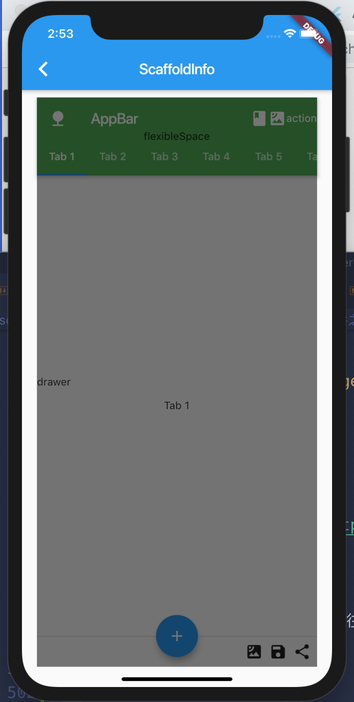
具体的内容还要自己实现。
bottomNavigationBar
在底部设置一个导航组件
1 | bottomNavigationBar: BottomAppBar( |
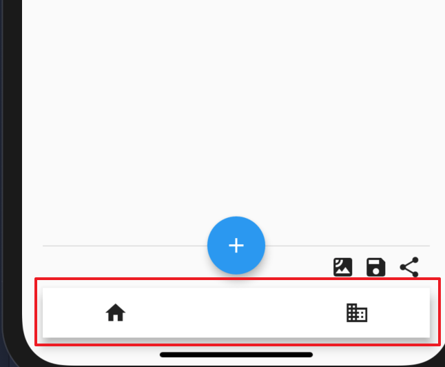
可以看到这样出来的效果很丑,这是因为我们之前设置了persistentFooterButtons这个属性,占据了上面一部分空间。一般这个属性我们都不会设置的,我们把persistentFooterButtons属性注释掉在来看看。
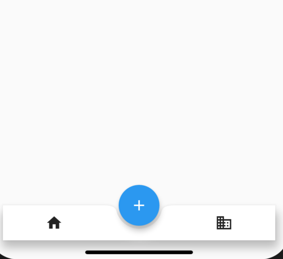
这样看起来好看多了。
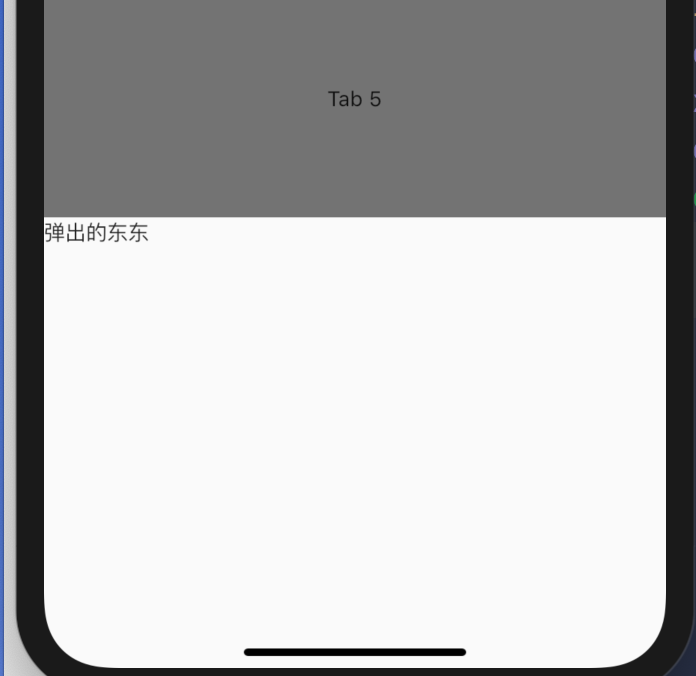
bottomSheet
底部划出组件,一般很少直接使用,而是使用showModalBottomSheet弹出,比如从底部弹出分享框。
1 | floatingActionButton: FloatingActionButton( |
点击 + 按钮会弹出这个
总结
Flutter的基础的组件就讲到这里,涉及到的大都是常用的组件,部分东西没有涉及到或者说没有详细说明,可能是因为我认为不用过多说明,可能是因为没有太多时间,也可能是因为我自己也不看明白,如果你不懂,我们可以一起探讨,在评论框留言,有问题我们一起探讨。
在下面的课程中,我们将会介绍一些Flutter的中高级的Widget。